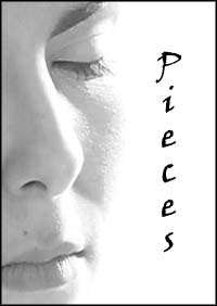
 Pieces is a love story. But instead of telling the story of one couple - or even of multiple couples that are acquainted with each other - it tells three separate stories that are unrelated.
The first story is about some American students studying in London. One of the young men meets an American woman, and they form a relationship. But when his attraction drops off, she drops a bomb - the "L" word. In the second story, a vibrant, successful woman goes on a few dates with a man whom she likes, but does not appear to want a serious commitment. This man, however, is far more committed than she is. The third story starts with a one-night stand that, surprisingly, ends up becoming a relationship. But it may not be able to sustain itself between the lives of two very independent people.
One very important fact about this movie - one which was lost on me until the director commented on the original draft of this critique - is that it was intended to be more of an art film that a mainstream one. Though my art background gives me some familiarity with this unique genre, Pieces appeared to be the film equivalent of the Minimalist movement - an artistic period in the 1960s and 70s whose goal was to strip art down to its most basic elements. In keeping with the goal of a minimalistic film, there are many aspects of Pieces that appear to be bad filmmaking, though many of these were done deliberately. It is quite hard to balance art and craft, and perhaps even more so to critiqueit. (As MFM's focus is on trying to help make films that are designed for a mass market or at least a large niche market, it should be pointed out that this film will likely miss both of these targets by intent.)
The arthouse element aside, this is a very good idea for a film, but the biggest problem, of course, is making sure that the audience doesn't lose their place. With three different story lines, there are a lot of characters involved, and even though the stories don't intertwine, I still found myself confused at times. Each story is indicated by the numbers 1, 2, and 3 on a white-on-black title card. The first one is easily identifiable, but the other two are preceded by a dip to black effect, which added to the confusion. Even after watching this movie twice, I still missed the numbers two and three. Halfway through the second story, I was able to figure out that the characters were not connected, but one certainly doesn't want an audience being taken away from the story because of this.
Besides this confusion, there was the added difficulty of not knowing any of the characters' names. Its possible that I may have missed them due to accents, but even with the Americans, I never noticed any names mentioned. One way around this - and to make each story stand out easier - would be to open each vignette with a title card containing both names of the couple involved, i.e. "One: Adam and Eve," or something to that effect.
Despite a minimalistic view, there is a lot of dialog in this film, some of which could be condensed into a montage. Kind of like the tongue-in-cheek bumper sticker expression, "Eschew Obfuscation," extraneous dialog seems counterintuitive to a Minimalist film. There are quite a few long takes with no dialog, a couple montages, and occasional random philosophizing between characters which was a nice added touch, but the longer speeches may be one reason why this movie seemed less like an art film. In addition, one also does not expect feature-length art films (though there are many directors who fall into this category, but a mainstream audience is more used to the stereotype of shorter art films). Either way, it might be a good idea to cut the dialog to bare essentials; after all, that was partly the point of minimalism.
In classic art film - and minimalist - fashion, this movie was shot in black white. There is always the temptation to shoot in color but, artistic feel notwithstanding, color adds a whole lot of new concerns into the equation. As I've said multiple times in my critiques: black and white CAN hide a multitude of sins!