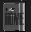
I really enjoyed the overall visual look of this movie. Vetter used a multitude of camera angles to add visual interest to his scenes. The shots were generally well framed and movements were fluid and smooth. One exception to this was the opening pan/pull from the Sluggers’ team photo hanging on the wall of Jason’s home. The idea was to pull out from the picture and pan simultaneously to capture Jason walking down the hall and looking at the picture. However, there are some odd rocking motions prior to the actual movement that framed Jason in the scene. I found that very distracting. This shot, although not the very first visual the audience sees, is critical because it opens the actual story. Keep in mind that what the audience sees in the first moments and last moments of a film will create their lasting impressions of it. Therefore, it is absolutely imperative to nail those sections.
The editing was another bright spot. The creativity employed in post production really added to the production value of the film. Vetter used split screens, wipes and other transitions to keep the film moving along and add interest to repetitive sequences. Even the graphics in the credits were creative and used animation sequences. This kind of post-production mirrors that of films with Hollywood budgets. Kudos, Caleb! Well done.
The lighting was also well done. The outdoor sequences seemed to be lit with ambient light. The interior sequences of Jason’s home were lit gorgeously! Shadows, spill light, etc. were all under control and gave the home the cozy, welcoming feeling that it deserved. There is one exception to this that I would definitely suggest changing, though. During a family game of Monopoly, there is a shot of Jimmy and his sister getting ready to the take their turns. Jimmy is costumed in a red shirt which amplified the red in the curtains and wreaked havoc with his skin tone. His sister’s skin looked much better because her green shirt provided contrast. However, it felt to me that I was seeing an entirely red screen; which was overwhelming.
There were a few additional things that should have been improved upon (or rotoscoped out in post). A number of bowling alley sequences had issues with additional film equipment being in the shot. For example, in one shot, a light and stand were clearly visible in the frame with Adam (Paul Greer). The
light shining directly into the camera behind his head created a noticeable halo effect.
There were also some issues with the set dressing at the alley. In some of the shots, only two lanes were even turned on. I realize it would have been a pain to fill the entire alley with people and it would have been difficult to record good dialogue with all that competing ambient sound. However, having the alley so sparsely populated with the other lanes turned off created a very low-budget moment in what could generally pass for a larger-budget film. Moving the guys to the lane closest to the wall while adding an audio track of additional ambient sound would have helped it seem more realistic without complicating the setup.